Travel to Change came to us with a great vision in mind. They were about to launch an international traveling agency focusing solely on ecotourism and sustainable traveling services. We were asked to dig deeper into the digital product design of travel websites and to conduct research about how tourists choose to book trips online. This resulted in a batch of hi-fi prototypes for the emerging web service, but also a brand identity and a representative logo.
The project started with the research phase where we looked closer at competing travel sites and different traveling habits of different generations. Unlike many travel websites, which have an abundance of information, Travel to Change’s user experience had to be considerably more stripped down. We also looked into travel website UX design studies that already had a lot of data on the subject.
How we developed the concepts in this project took place in the same way as for any website. It was an iterative process where we and the customer exchanged feedback regularly. An online survey was also conducted to listen to the audience’s point of views.
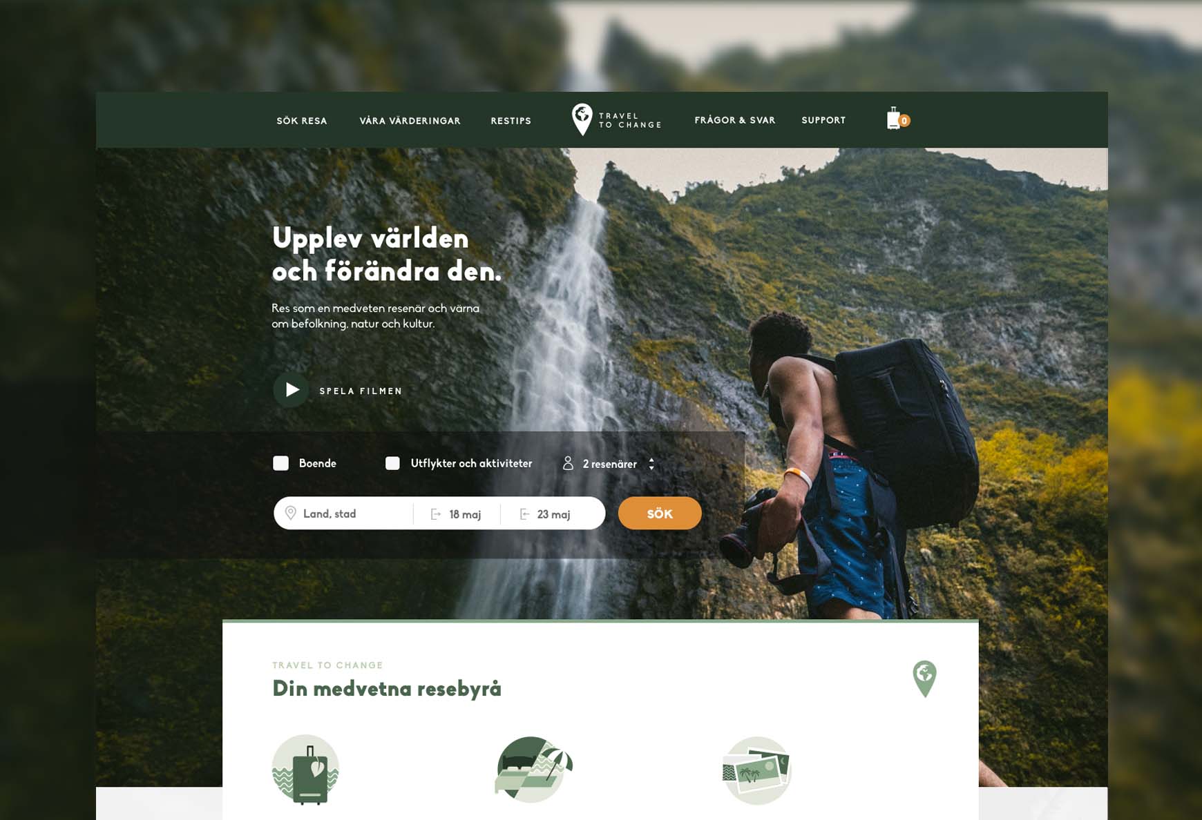
The home page
It was very important that the traveler could combine activity and accommodation in the booking experience of their trip. We made this clear on the home page in both the search section and the following section with the unique selling points listed.
In order to inspire visitors who had not yet planned their trip, we placed a section with links to the inspirational traveling guides and travel stories. The reason for this was found in our research. We were able to confirm that the most affluent target audience in the near future, the so-called “Millenial Travelers”, is largely influenced by content written by other travelers who made the same purchase. This type of content is also called user-generated content.
Travel to Change’s main idea was clear. Travelers would do good – while experiencing the world. Through reports, which we’re going to be sent out via mail, the idea was to let the traveler know how their travel funds actually made a difference. As a part of this idea, we decided to put the newsletter opt-in on the home page as a selling factor.
Our theory was that website visitors, who have not yet booked a trip, would be convinced to become subscribers through their curiosity for the reports and the willingness to do good. This theory was backed up during the research phase.

The shopping cart concept – with a twist
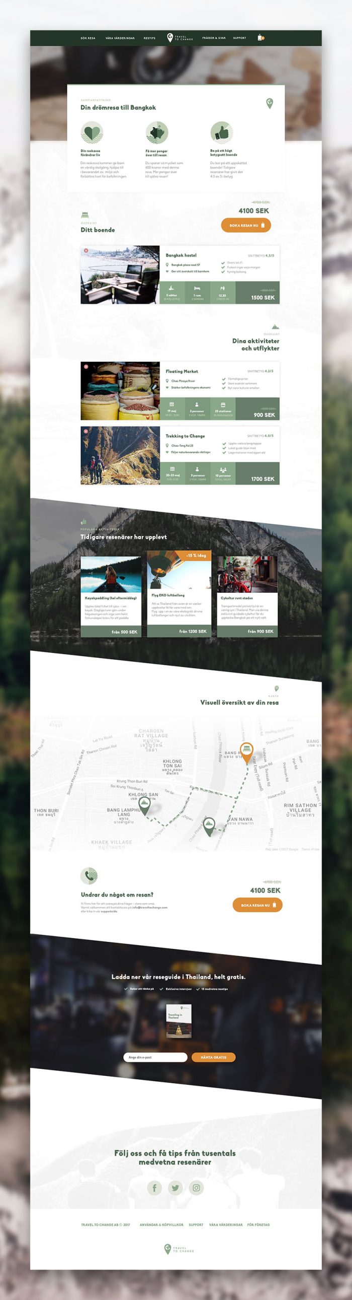
The accommodations and activities selected by the user on the website would end up in the shopping cart. More or less like a e-commerce website. But instead of using the term “shopping cart” we made the decision to take the concept one step further and let it be represented by something more suitable – a suitcase. After all, everything you buy before the trip, and everything you bring home, ends up in your suitcase.
Furthermore, we wanted to help the travelers to both visualize and plan their trip. This felt natural to do in the shopping cart section. We accomplished this by integrating Google Maps to let the user visualize their entire journey: Activities, accommodation and distances in between,
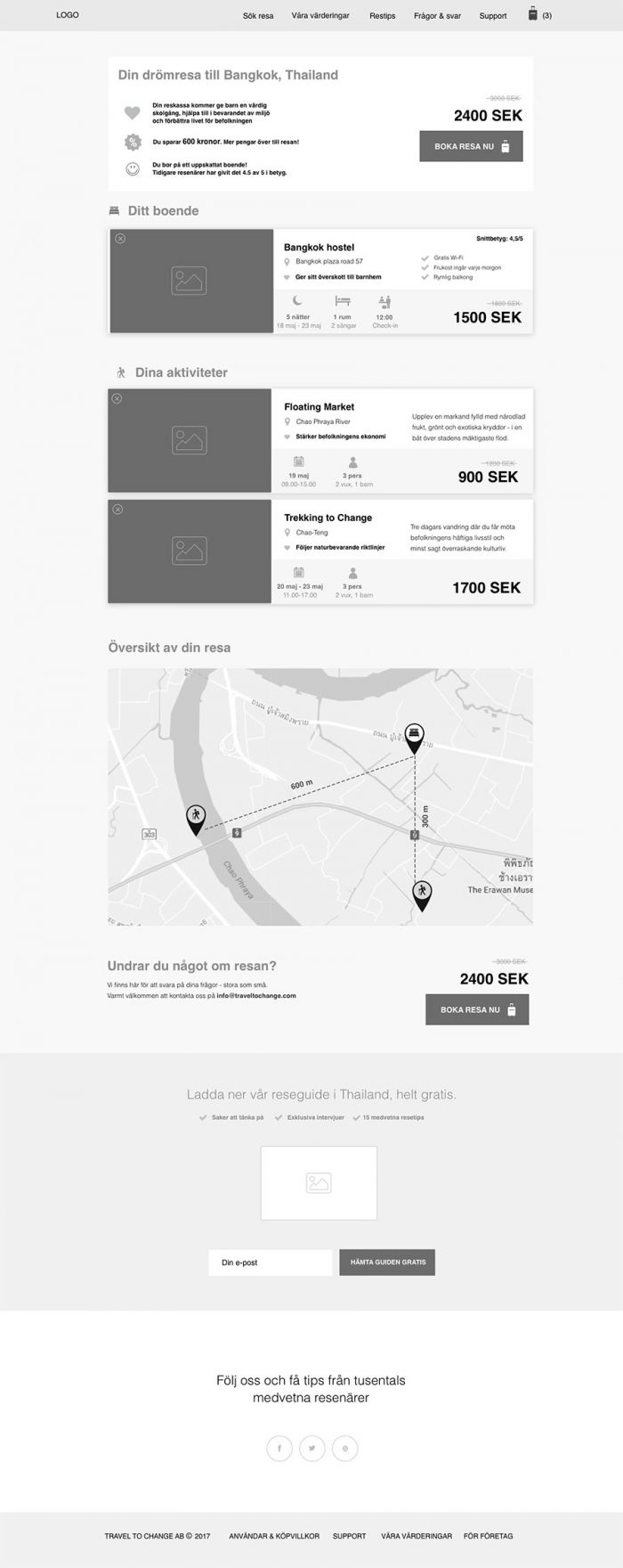
In order to increase additional sales, we also chose to provide space for popular activities that previous travelers experienced. These would show suggestions for more things the traveler can experience in the vicinity of the destination, in addition to the activities that he has already chosen.
Inspirational travel guides to ease the decision making
Further down the page, we chose to offer the visitor travel guides for their chosen destination – completely free of charge. The reasons for this were many. Traveling agency sites happen to have a high percentage of speculators leaving the shopping cart without spending a single cent. This is because the planning process of a trip is rarely done without comparing any alternatives before making a final decision.
The free inspirational travel guides opens up the opportunity to reach out to those who left the shopping cart and have them return. This is a particularly important part of a website design in order to retain customers. To also execute effective retargeting marketing, the travel guides we’re supposed to be emailed to users who left the checkout with an uncompleted form.
The main idea of the travel guides was also to help the visitor with research to increase the chance of completing the booking. By already doing a part of the research work for the user, they will eventually save a lot of time.
The logo design
The logotype that we designed for Travel to Change needed to communicate a clear message and had to be simplistic at the same time. By letting a map marker interact with a globe, and covering it in dark green, we wanted to communicate the modern way of traveling – sustainable and ecological.
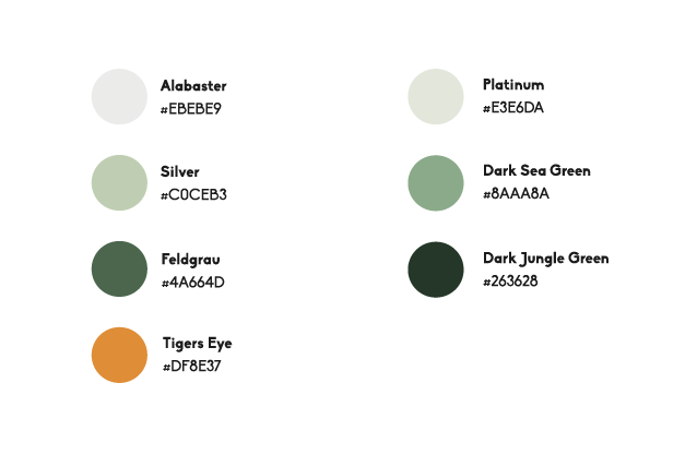
The sustainable brand identity
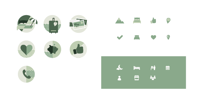
For us, it was obvious to choose a green color palette that took inspiration from the shades of the earth. An autumnal orange color was added to act as a contrasting color and was frequently used for the primary buttons in the prototypes. The illustrations that we created were also heavily inspired by the ecological and earthy feeling.