The Swedish theater Regionteatern needed to redesign their entire website and rework their branding for an upcoming launch. At Dreamify, we were responsible for the UX design process, SEO and web development for the new website.
UX audit and theater website competitor analysis
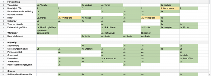
When it comes to website redesign, it’s always crucial to analyze a handful of relevant competitors in the given industry. By doing so for this project, we were able to pinpoint common features, interaction patterns and content among many of the big theaters in Sweden. This data was collected and documented via a so called UX audit, and became a vital information source for the design process.
After analyzing features and functionality in 8 different Swedish theaters or performing arts websites, we were able to discover some interesting findings:
- A majority of the theaters value social validation high and have implemented reviews from press & media.
- Virtually all theaters offer several audience-related discounts and gift certificates.
- All but one theater website had a calendar for showcasing the events on their own website whereof a majority of theme offer category filtering in the calendar.
- No theater has visible choices for customizing the web for users with certain needs or visual impairment. Neither do they offer and easy-to-read settings for content. However, accessibility is considered somewhat important as almost every theater hold an information page on accessibility and such guidelines.
- Only 2 out of 8 theaters have an internal ticket booking system on their own website. Most of them use external services for the checkout experience.
Web analytics
A vital part of the redesign process is to look closer at the current site. One way of doing so is to use web analytics tools to learn more about the current traffic. This could be about taking a look at the demographics, finding certain peaks and see where users tend to leave the site. In this project, we used Google Analytics and Hotjar. We used Hotjar mainly for collecting feedback and heatmaps.
Creating personas – Who are the users?
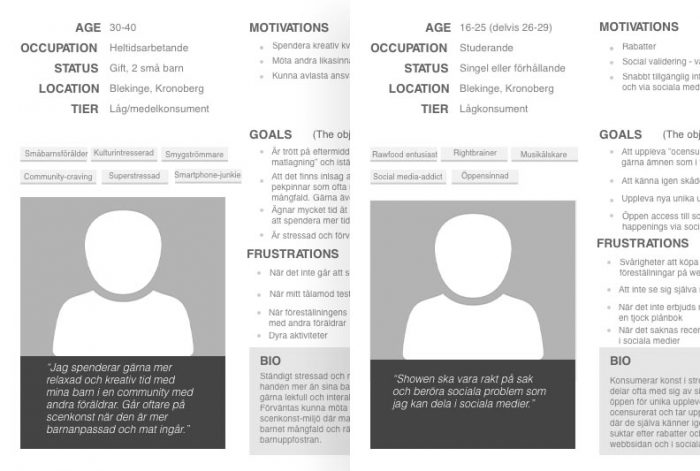
For this project, we wanted to create user personas for the theater website in order to document the needs and traits of the core audiences. By creating meaningful personas, we were able to more easily prioritize features and content for the website. Basically, the website consisted of two main types of users.
Firstly, the organizations who buy shows for groups or for educational purposes. These could be organizations such as theater associations or schools. Secondly, the consumers who are looking for an experience and are the ones who buy the tickets for the shows. These could be students, mostly belonging to the generation Z, or middle-class parents with young children.
Lo-fi sketches
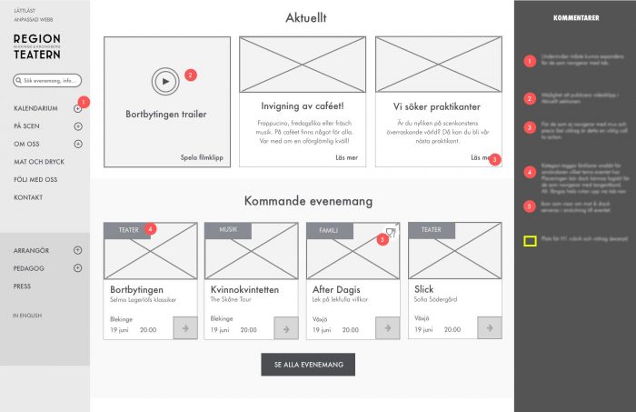
In order to better visualize the new pages and see new features in it’s right context, we created low fidelity sketches, also known as wireframes. The essential part of this in digital product design is to not focus on the looks but on the overall experience such as layout, structure, content and navigation.
Another important part of the design process is to list and categorize the pages of the upcoming website. In this case, based on the research findings, we made a lot of changes in the navigation. This resulted in a new hierarchy of information architecture.

Web development in WordPress
For the web development we built the site on WordPress, a CMS platform that we have both long and advanced experience in. The good thing about WordPress is that it’s very versatile, and that was just what we needed for this project.
Modules and reusable content structure
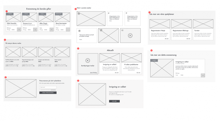
In order to streamline the content management on the website, it was important to find ways to reuse common content over and over again. To achieve this, we made the decision to create modules that could be easily customized and replaced anytime across the site. This was executed with the help of advanced custom fields, clear template structure and additional PHP programming. Choosing the right modules is more or less like a swiss-army knife. Each module has to work for several types of use cases in order to be valuable enough for the website in the long run.
Following WCAG – An accessible web for everyone
Today, it is more important than ever to make a website accessible for different users, no matter their needs or disabilities. Because of the fact that a theater event has to be accessible by everyone, the stakeholders for this project were specially keen on following such rules for the website as well.
Therefore, we carefully followed the rules of WCAG (Web content accessibility guidelines) during the web development of the website.
Example of changes that were applied according to WCAG were:
- Automatically let the user retrieve data in forms that we’re saved in the users browser – such as email and name
- Make it easy to enlarge texts
- Let the user understand different roles of text elements
- Allow the user to navigate with a keyboard in a logical order
- Let the user understand information not only on sensory characteristics
Events calendar and event gallery
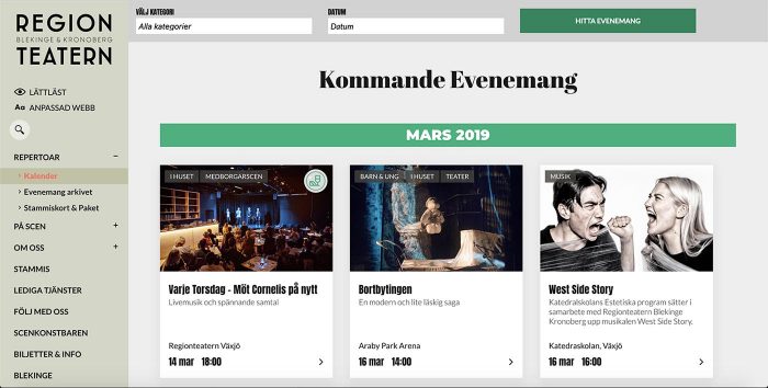
There was a clear need to improve both the event scheduling and the presentation of events for the new site. The research showed that it was too difficult to find information about the events and current repertoire on the previous site.
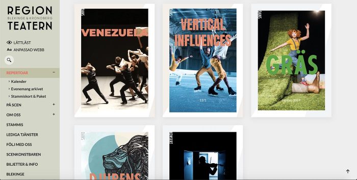
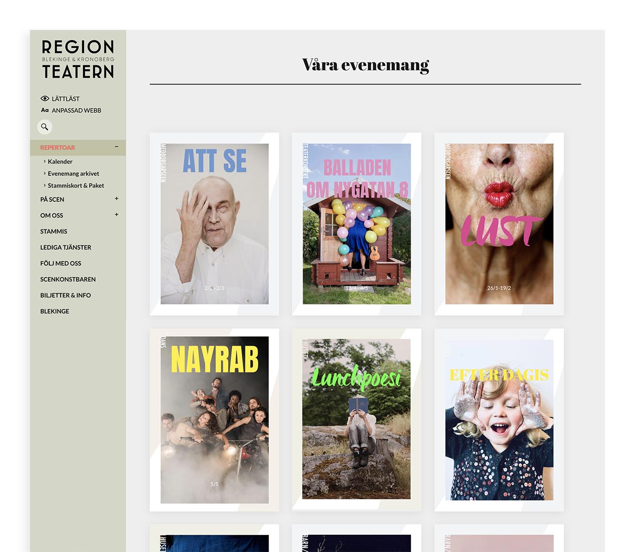
In order to make necessary improvements, we made the decision to implement an event calendar where users could filter and find events based on play-date or genre. To complement the calendar we also created a repertoire gallery where the images were supposed to mimic event posters.
